Top 63 Quotes & Sayings by Michael Bierut

Explore popular quotes and sayings by a graphic designer Michael Bierut.
Last updated on April 18, 2025.
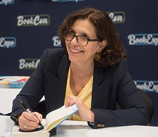
Michael Bierut

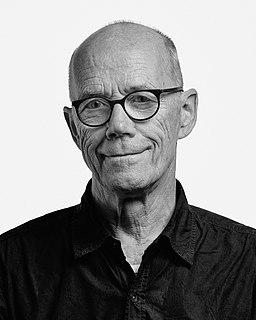
Michael Bierut is a graphic designer, design critic and educator, who has been a partner at design firm Pentagram since 1990. He designed the logo for Hillary Clinton's 2016 presidential campaign.

Graphic Designer | Born: 1957
A good cook can make something amazing out of even the blandest ingredients. Still, you don't want to eat the exact same dish every day.
I actually don't think that brand new logos are worth that much or mean that much in and of themselves. So why not have a class of third graders compete to design your logo?
If you do good work for good clients, it will lead to other good work for other good clients. If you do bad work for bad clients, it will lead to other bad work for other bad clients.
Australia is one of the few places that I can think of where the cities, at least those I've been to, seem to have strikingly different characters and visual textures. To an American like me, there's basically Melbourne, Sydney and Brisbane and the rest is all bush.
I have a bunch of calendars I used before I went digital. Every once in a while, I'll open up one from 1991 and look at all the names and appointments and things that, at the time, seemed so important. Meetings that I was really worried about, things that I was getting calls four times a day about, and I wonder, "Where did it all go? Where are they now?" It's so strange, everything has disappeared. The only thing that stays behind is the work.
The problem contains the solution. — © Michael Bierut
The problem contains the solution.
A lot of times, you design a logo to be timeless, but with something like the Olympics, timelessness is maybe not something you should be going for.
The truth about logos is that they are not that hard to do.
In the US you have New York, San Francisco, Los Angeles, Boston, Miami and dozens of other cities; a few of them have a really strong visual character. But even with those there is just too much space between them and too many people.
It was 4 or 5 years into my first design job before the idea of doing graphic design on computers started taking hold. I started working in 1980, the Macintosh was introduced in 1984, then the real desktop publishing only started coming around in 85-86, but it wasn't really until the end of the decade that the transition became irresistible.
The scientists at CERN were actually surprised that people commented on this. Reportedly Fabiola Gianotti, the coordinator of the CERN program to find the Higgs Boson, was asked why she had selected Comic Sans. She simply said, "Because I like it."
Most processes leave out the stuff no one wants to talk about: magic, intuition and leaps of faith.
I have a really shallow idea about what Australia is.
I have half a dozen designers who work for me, they 'realise' most of the design work, and I act as the design director and the main point of client contact on each project.
I believe sans serif typefaces - today upheld as models of neutrality and legibility - were called "Grotesques" in the 19th century because people thought they were hideous. But now we're used to them.
If you can announce the Higgs Boson in Comic Sans, clearly anybody can do anything.
Sometimes I will give some very vague directions to the designer that I'm working with on a particular project and they'll come back and surprise me with something that really shows a lot of their own 'hand' in it. Other times I'll have a really clear idea about how I want it done and I'll draw it out pretty precisely and say 'make it look exactly like this' and it will be something where it looks like I can say it was 'fully my design'. The work can also range between the two.
Designs that have a whiff of complex impenetrability tends to suggest big, complicated ideas. Academic writing tends to work the same way, I understand.
I actually think it almost works the other way sometimes: making a college textbook, say, look really "user friendly" tends to also make it look less "serious," even if nothing changes other than the design treatment.
It's a cliché, but typefaces are really just ingredients. — © Michael Bierut
It's a cliché, but typefaces are really just ingredients.
I grew up in a Cleveland suburb called Parma, Ohio. Somewhere along the way I fell in love with a typeface called Bodoni. It turns out that Giambattista Bodoni had his foundry in Parma, Italy. So I pick Bodoni because us guys from Parma have to stick together.
It's hard to predict what will happen as reading on screen becomes more of a universal norm, and when the formats dictated by social media - Twitter's 140-character limit, for instance - start to influence what we're used to.
Part of maturing as a designer is discovering what you're good at.
If typography is calling attention to itself, it's taking that attention away from what the words are saying.
No one loves authenticity like a graphic designer. And no one is quite as good at simulating it.
Not everything is design. But design is about everything. So do yourself a favor: be ready for anything.
A simple MS Word document, or a Powerpoint presentation, has its limits, particularly the unpredictability in how the page will actually display. With a PDF, you are locking down all those variables.
The Nike swash that cost $30 and was designed by a Portland State University art student was probably worth that when she first showed it to them. At that point it had no equity at all. None of the guys commissioning it particularly liked it, they all wanted the Adidas three stripes and they thought that was a good logo.
Every little job counts. Design counts.
Australia has always put out some good design, particularly environmental graphics. I associate that with Australia, more so that a lot of other places. Whether that has anything to do with the landscape, who knows?
Target for example, is just a dot with a circle around it, that's all it is, so if you want a logo like Target, you don't need to hire a designer, you barely need to know how to operate a computer program, the logo may as well be anything.
I had a lot of enthusiasms that were very contradictory, I was never very doctrinaire in the type of design I wanted to do.
I wanted to be a graphic designer from the time I was 15, without ever having actually met one. I lived in the mid-west, not in a media centre, and I didn't know anyone who did that for a living. It took me a while to find out what that thing I wanted to do was actually called, but once I sorted that out I got really interested in it.
I think different designers have different points of view and different strong personalities can influence the way certain cities are perceived.
We get used to things, and we like reading the way we're used to reading.
It was stone carvers in ancient Rome, scribes in the Middle Ages, all the way through Gutenberg to the present day. That's a pretty long track record. More likely we may reach a point where each one of us is a typographer with our own custom proprietary typeface.
Compared with now when almost everyone knows what graphic design is and has some sort of access to the tools to make it, back then, it was really esoteric, you had to quantify it as being 'like commercial art', as one still does in certain circles. It was a strange thing to want to do for a living.
I think once the artistic world of the type designer merged with the scientific world of the computer programmer, you began to see this crossover.
Most people have no idea how much goes into designing a typeface. Twenty-six letters in the alphabet, usually with two versions of each, upper and lower case. Punctuation and alternate characters and numbers - let's not forget numbers - can add another 40 or so.
I can see how some people get sentimental about how we used to do things in 'the good old days' but in a way I just think they are being nostalgic for the way they were brought up.
The design of the notorious Palm Beach County "butterfly ballot" in the 2000 Presidential election is certainly one of them. But I would say most of the time this is less about a conscious attempt to manipulate an outcome, and more about pure ineptitude.
Australia seems to strike a balance between big and small. It's big enough to have that diversity, but not so big that it disintegrates into something that is not connected.
I've heard some designers talk about the design process being centred on invention, starting with a blank slate. I admire that and occasionally I'm capable of that, but I have to admit that I really have trouble working with completely open briefs.
Good typography, first, makes words readable. At its best, it does something more: it helps express the animating spirit of the ideas behind the words. — © Michael Bierut
Good typography, first, makes words readable. At its best, it does something more: it helps express the animating spirit of the ideas behind the words.
BE PURPOSEFUL AND THOUGHTFUL IN THE CHOICES YOU MAKE WHEN THE OPTIONS ARE NEARLY INFINITE.
Graphic design is the fiction that anticipates the fact.
I think that you could design a terrible logo for a good company with great people and they could build it into a great program. Alternatively you could design what seems to be a brilliant logo for people who are not smart or energetic or are incapable of associating with anything positive and it would become a terrible logo.
When it comes to working on identities, a lot of the time I find myself working with a company that has been around for a while. No matter what they say their goal is, the history and the impression that they have already made in the minds of the public is a real thing that you have to deal with.
There was a time when most people had a choice between two kinds of personal communication, handwriting or using a typewriter. Today, people are invited to choose from a list of (surprisingly exotic) typefaces every time they turn on their computer. I think this has made everyone more aware of the idea that picking a typeface is a conscious choice.
I'm not sure about my design work every time.
I'm not an expert in typefaces that serve scientific writing, but I'd guess that's another dozen or two.
If you ask people in the US what logos they like and recognise, they'll name Target or Nike.
Certain kinds of typeface design and typographic design are designed to persuade: we can make this company look modern if we use a crisp sans serif typeface, or we can make this restaurant look like its been around forever if we use typefaces and layout styles that have been around forever too. But there are other categories, and ballot design is one of them, where the goal should be to be purely functional. There have been notable failures in this category.
We use the word typography to describe two different things: the design of letterforms, and the layout of typeset passages on a page. Both of those experiences are really important to communicating information, especially when that information involves complex ideas.
People in the UK will say that the design community in the US is much more coherent than other countries. It has no government support at all, so it's really like a grass roots thing.
Simplicity, wit, and good typography. — © Michael Bierut
Simplicity, wit, and good typography.
I'm always conscious of the context, the history, the specific environment of anything that I design and what it is going to be operating within.
A lot of times, you design a logo to be timeless, but with something like the Olympics, timelessness is maybe not something you should be going for. Maybe you should be trying to come up with something that will really become associated with a moment in time, a few weeks, that happened, period. Then you look back, think about it and connect it with that time. It may look dated later but it will be still be evocative.
Everyone can have an opinion on a logo.
If you look at the Olympic graphics for Mexico or Los Angeles, those programs don't look contemporary by today's eyes but they really look like they are of their place and time.
This site uses cookies to ensure you get the best experience. More info...
Got it!