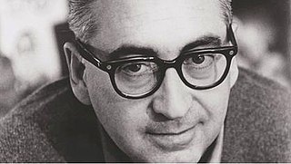
Explore popular quotes and sayings by an American designer Saul Bass.
Last updated on November 23, 2024.
Saul Bass was an American graphic designer and Oscar-winning filmmaker, best known for his design of motion-picture title sequences, film posters, and corporate logos.
In TV you have to open a show the subject, you deal with an idea. Then you deal with a sponsor - but fast. Then you have to announce the guest stars. As a result, you have a big fat 30, 40 seconds - 50 if they really lose their heads - to put together an unbelievable mishmash.
Design is thinking made visual.
The goal, and the ultimate achievement, is to make people feel as well as think.
A corporation trademark represents a total program for a company. A good symbol will implement its products. Normally such a symbol will be around for an indefinite future 10, 20, 30 years or more.
The products people like best start with function and wind up with look.
A new 'look' for any organization cannot be a papier-mache cover, tacked on with Scotch tape under the heading of 'beautification.' It has to be based on a probing examination of the company and the people who work for it. As a result, the eventual external visual design becomes the graphic extension of the internal realities of a company.
If it's simple simple, it's boring. We try for the idea that is so simple that it will make you think and rethink.
I began as a graphic designer. As part of my work, I created film symbols for ad campaigns. I happened to be working on the symbols for Otto Preminger's 'Carmen Jones' and 'The Man With The Golden Arm' and at some point, Otto and I just looked at each other and said, 'Why not make it move?' It was as simple as that.
The key to industrial leadership is technology and design; of the two, technology is quantifiable and design is not. Technological improvements might make your product worth another $20. If you design something beautiful, what is that worth? It's worth whatever people will pay for it.
If the titles are treated in a straightforward way, nobody is really interested. The theory is that in those two or three minutes, you can set the tone for the films, so that when the story begins the audience hits the ground running.
This is my real concern: to give each film a unique individuality.
Way back in the beginning, I would say in the 20s, when titles were first being treated for films, there was a lot of crazy stuff going on. Everybody was inventing. There were no conventions. Everything was up for grabs.
I want to make beautiful things, even if nobody cares.
Hitchcock loved long convoluted shots that contained a lot of tracking and camera moves.
My work on titles was a marvelous opportunity to learn about filmmaking. I think I touched on just about every aspect of the process, both creative and technical. And I worked with many wonderful people.
I've watched Spike Lee's career with interest, and he seemed to be striving for an original and moral point of view.
When a well-known creative person such as me is perceived to have created a knockoff of my own previous work, such a perception is a mortal blow to my reputation as a creative person.
I want everything we do to be beautiful. I don't give a damn whether the client understands that that's worth anything, or that the client thinks it's worth anything, or whether it is worth anything. It's worth it to me. It's the way I want to live my life.
All fliers have some concern about flying. Some handle it by 'flying' the plane. They're 'raising' the wheels, 'making' the turns and so on. Others handle it by tuning out... reading a book or watching a movie.
The ideal trademark is one that is pushed to its utmost limits in terms of abstraction and ambiguity, yet is still readable.
In 'Cape Fear,' all that water and the reflections and these threatening and submerged images in the water - that signals the awfulness that is to come. We're very good at awfulness. No, really, we do do some sweet titles, too.
I shattered the notion that a movie had to be advertised with realistic elements from the story.
To engage in downright plagiarism is disappointing. It's cynical, opportunistic and hypocritical.
Interestingly enough, the storyboard... that I did for 'Psycho' went precisely as I laid it up, and there was no change on that. And frankly, I myself at that point didn't even really understand the impact that some of these things would have.
I work on the assumption that in the crowded mass communication field today you have to get in and get out with your message as quickly and simply as possible. You must communicate the maximum with a single glance.
In the course of our daily lives, we're bombarded with a barrage of visual messages, some blatantly aggressive, some subtle. The trick is to find a way to break through without adding to the clutter and the ugliness. We have to be responsible about that.
The average individual lives in a high impact, complex, visual environment.
Trademarks are usually metaphors of one kind or another. And are, in a certain sense, thinking made visible.
When Braniff abandoned stripes, they wound up with a flying jelly bean and that's not a good feeling for passengers.
Somewhere down the line, I felt the need to come to grips with the realistic - or live action - image which seemed to me central to the notion of film. And then a whole new world opened to me.
The very first pieces of film that I did were really graphic designs translated to film. Graphic designs that moved. That was a very new notion.
At one point it occurred to me that the title could make a more significant contribution to the storytelling process. It could act as a prologue.
No artist wants to be perceived as a regurgitator.
Somewhere along the line a convention developed that the opening of a film was just a laundry list of credits. There was no incentive to complicate an area that was settled.
We are truly bombarded by images. To break through and be observed, let alone focused on, you have to have impact and power.
My initial thoughts about what a title can do was to set mood and the prime underlying core of the film's story, to express the story in some metaphorical way.
Dishonesty in trailers is more than a moral issue, it's a practical one. If you don't deliver in the film what you offered in the trailer, you'll get bad word-of-mouth.
When I provided the disembodied arm as the logo for 'The Man With the Golden Arm,' it was the first time an advertising-publicity campaign was based on a single symbol. Until then film companies used a variety of symbols and photographs to cover all bets. The concept of using one logo was mine and Otto Preminger's.
I had felt for some time that audience involvement with a film should begin with its first frame.
In 'Age of Innocence,' the opening flowers, that's a metaphor for the film, the Victorian veneer with the malevolence beneath it. We attempted to show that with flowers that start as sweet and then slowly become malevolent.
I saw the title as a way of conditioning the audience, so that when the film actually began, viewers would already have an emotional resonance with it.
There's nothing more damaging than an irate moviegoer who hasn't seen what the film trailer promised.
The only way I work as a designer is to consciously avoid specialisation.
I think that the sun*like rainbow growing out of the hand is open to many alternate positive interpretations. One may say it's the hand of the United Way bringing hope to people. But it helps signal that United Way is vibrant, exciting, colorful, positive and changing.
My position was that the film begins with the first frame and that the film should be doing a job at that point.
In TV the main purpose is to have them keep their hands off the dial. In movies, where you have a captive audience, the opening is intrinsic to the film.
My view... was that something could happen during the credits that could help the film, so that the establishing shots aren't carrying the total burden.
A product is often a consumer's only window to a corporation.
I'm a filmmaker and I intend to continue making films of all kinds, in any manner, shape, or form - short or long.
Tampering with humanity is pretty scary.
There's nothing worse that you can do than create an aura about a company that's not substantiated by fact. It's not only ineffective but actually harmful to the company. You can create an image or whatever, but it won't stick.
Corporate identity deals with how a company is perceived. When you're working for a company, you try to determine what the optimum perception of them should be and develop a set of objectives that often take the form of reinforcing what's there that's perceived to be desirable and finding a way of dealing with misperceptions.
The nature of process, to one degree or another, involves failure. You have at it. It doesn’t work. You keep pushing. It gets better. But it’s not good. It gets worse. You got at it again. Then you desperately stab at it, believing “this isn’t going to work.” And it does!
You know, whenever I was presented with a challenge that brought up feelings of fear or self-doubt, I almost always said, 'Yes'.
Failure is built into creativity... the creative act involves this element of 'newness' and 'experimentalism,' then one must expect and accept the possibility of failure.
Try to reach for a simple, visual phrase that tells you what the picture is all about and evokes the essence of the story
Logos are a graphic extension of the internal realities of a company.
I want to make beautiful things, even if nobody cares, as opposed to ugly things. That's my intent.
Interesting things happen when the creative impulse is cultivated with curiosity, freedom and intensity.
My initial thoughts about what a title can do was to set mood and the prime underlying core of the film's story, to express the story in some metaphorical way. I saw the title as a way of conditioning the audience, so that when the film actually began, viewers would already have an emotional resonance with it.