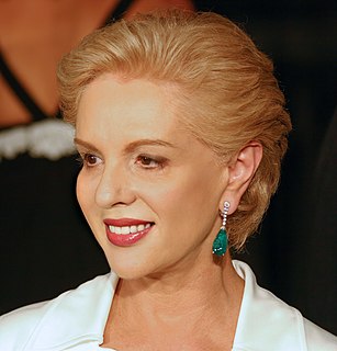
A Quote by Alice Temperley
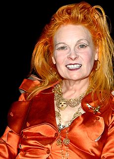
Red carpet dressing all depends on the climate. I think richer, deeper colours are more flattering on the body, but the opposite is true if you are in Cannes or St. Tropez where the light makes deep colours look heavy and unflattering.
Related Quotes
From what has been said it is also evident, that the Whiteness of the Sun's Light is compounded all the Colours wherewith the several sorts of Rays whereof that Light consists, when by their several Refrangibilities they are separated from one another, do tinge Paper or any other white Body whereon they fall. For those Colours ... are unchangeable, and whenever all those Rays with those their Colours are mix'd again, they reproduce the same white Light as before.
Turning to the colour-classification methodology: The starting point are the four pure colours red, yellow, green and blue; their in-between shades and scales of brightness result in colour schemes containing 16, 64, 256 and 1,024 shades. More colours would be pointless because it wouldn't be possible to distinguish between them clearly.
Since becoming a pop star, I've experimented a lot more. I've gotten more creative with what I wear. My stylist is a bit more adventurous than I would normally be, but it's really worked, and the colours really work together. I think everyone should be a bit more confident: if it's a summer's day, wear some bright colours.
Fred didn't have a favourite colour. He was just pleased that he could see all of the colours in the colour chart. That was his wish for everyone. Fred wanted people to experience the joy of seeing vivid colours - in nature: the greens and browns of the mountains; in their work: the orange, red and black of the back of the retina; and in life.
We just worked hard to not just get things right and authentic, but also to make it consistent and visually right. For instance, there are colours that aren't in the film that would have been there in reality. I think part of the look of the film not only has to do with the way it's shot and lit, but also the lack of certain colours that give it a softness which really suits it because there's more focus on the characters. For instance, there's no yellow at all until we get to Miss Stubbs' flat at the very end.

