A Quote by Cynthia Rowley
The whole point is that colors that are harder to wear, like pink, less expected, or maybe not as commercial; if they're used in the right way, they can make a design way more compelling, especially in menswear where color isn't often used. I think it's really exciting to have a lot of color in men's stuff.
Related Quotes
Everybody's going to do the 3D slightly differently the same way that people are going to deal with color differently. Some movies downplay the color, some color is very vibrant. Color design is very different. We've got to think of 3D like color or like sound, as just part of the creative palette that we paint with and not some whole new thing that completely redefines the medium.
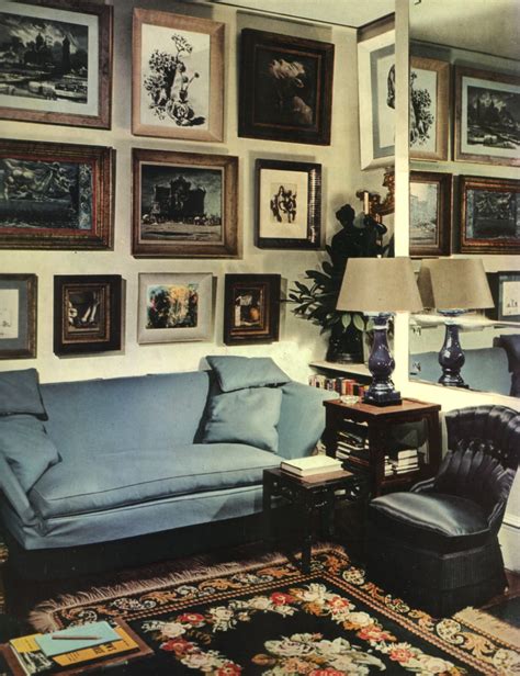
I suppose the most marked example of color as structure is in the Byzantine use of mosaic decoration that becomes architecture. The decoration of the interiors so related to the form that they fuse. In less elaborate interior design this is always the ideal approach to color - used not only as just color alone.
I like black for clothes, small items, and jewelry. It's a color that can't be violated by any other colors. A color that simply keeps being itself. A color that sinks more somberly than any other color, yet asserts itself more than all other colors. It's a passionate gallant color. Anything is wonderful if it transcends things rather than being halfway.
The difficulty with color is to go beyond the fact that it's color ? to have it be not just a colorful picture but really be a picture about something. It's difficult. So often color gets caught up in color, and it becomes merly decorative. Some photographers use it brilliantly to make visual statements combining color and content; otherwise it is empty.
Homesickness is a great teacher. It taught me, during an endless rainy fall, that I came from the arid lands, and like where I came from. I was used to dry clarity and sharpness in the air. I was used to horizons that either lifted into jagged ranges or rimmed the geometrical circle of the flat world. I was used to seeing a long way. I was used to earth colors--tan, rusty red, toned white--and the endless green of Iowa offended me. I was used to a sun that came up over mountains and went down behind other mountains. I missed the color and smell of sagebrush, and the sight of bare ground.
