A Quote by David Papineau
If neuroscientific research shows that those mechanisms only contain comparative information about colour differences, and have 'thrown away' more fine-grained information about the absolute colours of single surfaces, then that would support my position, in a way that just introspecting our colour experiences can't.
Related Quotes
The orthodox view of colour experience assumes that, when we see a colour difference between two surfaces viewed side-by-side, this is because we have different responses to each of the two surfaces viewed singly. Since we can detect colour differences between something like ten million different surfaces, this implies that we are capable of ten million colour responses to surfaces viewed singly.
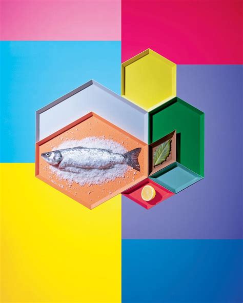
Turning to the colour-classification methodology: The starting point are the four pure colours red, yellow, green and blue; their in-between shades and scales of brightness result in colour schemes containing 16, 64, 256 and 1,024 shades. More colours would be pointless because it wouldn't be possible to distinguish between them clearly.
There needs to be more film directors of colour. They bandy about the word 'diversity' a lot, but when I say 'of colour,' I mean Asian, black - I mean people of all colour. We need to have those voices given the opportunity, not told that their films will not be distributed or will not sell well abroad.
I often use colour to attack form, to break it down a little or begin to dissolve it. But I am not at all interested in 'pure' colour or in colour as a transcendental presence... So if I use colours to begin to dissolve forms, I also use forms to prevent colours becoming entirely detached from their everyday existence.
Fred didn't have a favourite colour. He was just pleased that he could see all of the colours in the colour chart. That was his wish for everyone. Fred wanted people to experience the joy of seeing vivid colours - in nature: the greens and browns of the mountains; in their work: the orange, red and black of the back of the retina; and in life.
Normally if you add information to information, you have more information. In case of my art, I destroy information, I would say, because the image is disturbed by the writings. In a way, they become pure imagery. For me it's really fun because it's an idealistic approach to images, to just play around with information and see what's happening.
If I were writing an article for the newspaper, it would be thesis statement, information, information, supporting arguments. That would be the setup. When I'm making a documentary, the pacing of the film and the way that you sort of switch from character to character - all of those are more about storytelling than straight journalism.

