A Quote by Henri Matisse
Put a colour upon a canvas - it not only colours with that colour the part of the canvas to which the colour has been applied, but it also colours the surrounding space with the complementary.
Related Quotes
Colour, as the strange and magnificent expression of the inscrutable spectrum of Eternity, is beautiful and important to me as a painter; I use it to enrich the canvas and to probe more deeply into the object. Colour also decided, to a certain extent, my spiritual outlook, but it is subordinated to life, and above all, to the treatment of form. Too much emphasis on colour at the expense of form and space would make a double manifestation of itself on the canvas, and this would verge on craft work.
I often use colour to attack form, to break it down a little or begin to dissolve it. But I am not at all interested in 'pure' colour or in colour as a transcendental presence... So if I use colours to begin to dissolve forms, I also use forms to prevent colours becoming entirely detached from their everyday existence.
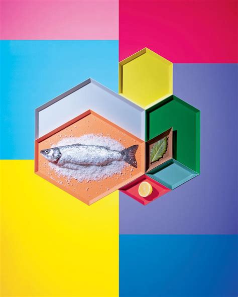
Fred didn't have a favourite colour. He was just pleased that he could see all of the colours in the colour chart. That was his wish for everyone. Fred wanted people to experience the joy of seeing vivid colours - in nature: the greens and browns of the mountains; in their work: the orange, red and black of the back of the retina; and in life.
Turning to the colour-classification methodology: The starting point are the four pure colours red, yellow, green and blue; their in-between shades and scales of brightness result in colour schemes containing 16, 64, 256 and 1,024 shades. More colours would be pointless because it wouldn't be possible to distinguish between them clearly.
If neuroscientific research shows that those mechanisms only contain comparative information about colour differences, and have 'thrown away' more fine-grained information about the absolute colours of single surfaces, then that would support my position, in a way that just introspecting our colour experiences can't.
I'm actually a 'Witch' not Wiccan...justa Witch. I started reading Tarot when I was 8 years old. I dabble in astrology, Candle Magick, gems/stone Magick and I mainly use herbs for cooking. But cooking is it's own Magick-when done right. Actually, when I colour Tarot...I do use a form of Colour Magick..colours do influence mood...so I conscienciously choose certain colours for certain scenes.
If the image was sketched onto the canvas and spontaneously drawn, colour would often be restrained and unfree... The most important and the most difficult liberation process we went trough, the one that has distinguished our art, was the freeing of colour, the transition to a painterly spontaneity.
