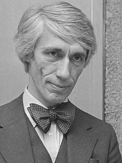
A Quote by Herb Lubalin

Typography can be as exciting as illustration and photography. — © Herb Lubalin
Typography can be as exciting as illustration and photography.
Just as typography is human speech translated into what can be read, so photography is the translation of reality into a readable image.
I hope my work isn't dismissed by the critics as illustration or photography.
Typography needs to be audible. Typography needs to be felt. Typography needs to be experienced.
I majored in illustration at the Rhode Island School of Design, although I never had any intention of being an illustrator and didn't take any classes in illustration there. It was just that the illustration degree had no requirements.
In a world rife with unsolicited messages, typography must often draw attention to itself before it will be read. Yet in order to be read, it must relinquish the attention it has drawn. Typography with anything to say therefore aspires to a kind of statuesque transparency. It's other traditional goal is durability: not immunity to change, but a clear superiority to fashion. Typography at its best is a visual form of language linking timelessness and time.
Typography has one plain duty before it and that is to convey information in writing. No argument or consideration can absolve typography from this duty.
The better people communicate, the greater will be the need for better typography-expressive typography.
Typography is a hidden tool of manipulation within society. All schools should be teaching typography; we should be fundamentally aware of how typographic language is forming out assholes.
I wish more people felt that photography was an adventure the same as life itself and felt that their individual feelings were worth expressing. To me, that makes photography more exciting.
Photography was increasingly being seen as something outside the art world. As a sort of illustration. They just fired the director of photography at the Sunday Times Magazine - that's where everyone went with their photo essays in the '60s, '70s, and '80s. It was the place to get published. It is an issue. And I feel it. There's no budget. The budget-holders are very often people who've been to the professional colleges where art is not taught. So art as a part of education is something that's missing - since Thatcher's day, anyway.
Lyric poetry is, of course, musical in origin. I do know that what happened to poetry in the twentieth century was that it began to be written for the page. When it's a question of typography, why not? Poets have done beautiful things with typography - Apollinaire's 'Calligrammes,' that sort of thing.
The gospel is not just the illustration (even the best illustration) of an idea. It is the story of actions by which the human situation is irreversibly changed.
I like to think of Photography 1.0 as the invention of photography. Photography 2.0 is digital technology and the move from film and paper to everything on a chip. Photography 3.0 is the use of the camera, space, and color and to capture an object in the third dimension.
If you love it, you don't know much about typography. And if you hate it, you really don't know much about typography either and you should get another hobby.
I'm a big illustration and comic book fan. In my eyes, comic books and illustration are the same kind of art forms.
It's good when someone comes to a book or a movie and interacts with it. It's the difference between an illustration and a painting. An illustration serves a specific purpose, and a painting is something you can immerse yourself in.
This site uses cookies to ensure you get the best experience. More info...
Got it!