A Quote by Joan Miro
Little by little, I've reached the stage of using only a small number of forms and colors. It's not the first time that painting has been done with a very narrow range of colors. The frescoes of the tenth century are painted like this. For me, they are magnificent things.
Related Quotes
Then very slowly I go to slightly lighter colors until little by little, the forms begin to take shape and I start to see what is happening. Since I never plan in advance, I simply let myself be led by instinct, taste and intuition. And it is in this manner that I find myself creating visions that I have never before imagined. And little by little certain color effects develop that excite me and I find the painting itself leading me on and I become only an instrument of a greater, wiser force...or being...or intelligence than I myself am.
In 1915 Sophie Tauber and I carried out our first works in the simplest forms, using painting, embroidery and pasted paper (without using oil colors to avoid any reference with usual painting). These were probably the first manifestations of their kind, pictures that were their own reality, without meaning or cerebral intention. We rejected everything in the nature of a copy or a description, in order to give free flow to what was elemental and spontaneous.
The little boy went first day of school He got some crayons and started to draw He put colors all over the paper For colors was what he saw And the teacher said.. "What you doin' young man?" "I'm paintin' flowers" he said She said... "It's not the time for art young man And anyway flowers are green and red There's a time for everything young man And a way it should be done You've got to show concern for everyone else For you're not the only one.
At some time in the recent past someone had decided to brighten the ancient corridors of the University by painting them, having some vague notion that Learning Should Be Fun. It hadn’t worked. It’s a fact known throughout the universes that no matter how carefully the colors are chosen, institutional decor ends up as either vomit green, unmentionable brown, nicotine yellow or surgical appliance pink. By some little-understood process of sympathetic resonance, corridors painted in those colors always smell slightly of boiled cabbage—even if no cabbage is ever cooked in the vicinity.
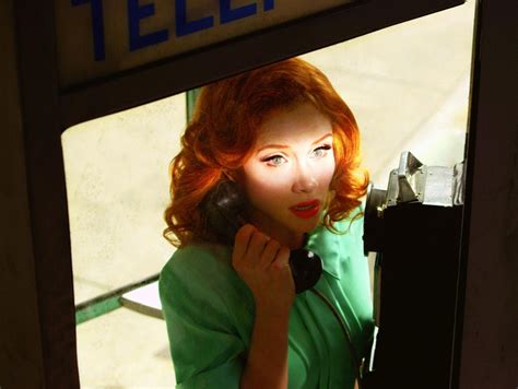
I like to use really basic or classic colors, things that people have seen over and over and over again. Primary colors, at least in photography, have been around a lot longer than neon colors and really vibrant purples, hot pinks. Red, blue, yellow, orange - because of Kodachrome and the way that things were produced I think that those colors stood out more than any others.
Words in the mind are like colors on the palette of the artist. The more colors we have access to, the easier it is to create a captivating picture on the canvas, and the more practice we give to using those many colors appropriately and uniquely, the more likely we will be to create a masterpiece of self expression.
