A Quote by John Dyer
I use a wide selection of colours. It is impossible to produce work like mine using only the primary colours as they only mix a certain range of colour.
Related Quotes
Based on mixtures of the three primary colours, along with black and white, I come up with a certain number of possible colours and, by multiplying these by two or four, I obtain a definite number of colour fields that I multiply yet again by two, etc. But the complete realization of this project demands a great deal of time and work.
I often use colour to attack form, to break it down a little or begin to dissolve it. But I am not at all interested in 'pure' colour or in colour as a transcendental presence... So if I use colours to begin to dissolve forms, I also use forms to prevent colours becoming entirely detached from their everyday existence.
I'm actually a 'Witch' not Wiccan...justa Witch. I started reading Tarot when I was 8 years old. I dabble in astrology, Candle Magick, gems/stone Magick and I mainly use herbs for cooking. But cooking is it's own Magick-when done right. Actually, when I colour Tarot...I do use a form of Colour Magick..colours do influence mood...so I conscienciously choose certain colours for certain scenes.
Fred didn't have a favourite colour. He was just pleased that he could see all of the colours in the colour chart. That was his wish for everyone. Fred wanted people to experience the joy of seeing vivid colours - in nature: the greens and browns of the mountains; in their work: the orange, red and black of the back of the retina; and in life.
The main purpose of my work is to provoke people into using their imagination. Most people spend their lives in dreary, grey-beige conformity, mortally afraid of using colours. By experimenting with lighting, colours, textiles and furniture and utilizing the latest technologies, I try to show new ways to encourage people to use their phantasy and make their surroundings more exciting.
There is silver blue, sky blue and thunder blue. Every colour holds within it a soul, which makes me happy or repels me, and which acts as a stimulus. To a person who has no art in him, colours are colours, tones tones...and that is all. All their consequences for the human spirit, which range between heaven to hell, just go unnoticed.
Turning to the colour-classification methodology: The starting point are the four pure colours red, yellow, green and blue; their in-between shades and scales of brightness result in colour schemes containing 16, 64, 256 and 1,024 shades. More colours would be pointless because it wouldn't be possible to distinguish between them clearly.
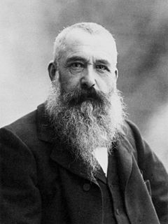
If, I can someday see M. Claude Monet's garden, I feel sure that I shall see something that is not so much a garden of flowers as of colours and tones, less an old-fashioned flower garden than a colour garden, so to speak, one that achieves an effect not entirely nature's, because it was planted so that only the flowers with matching colours will bloom at the same time, harmonized in an infinite stretch of blue or pink.
