A Quote by John Van Hamersveld
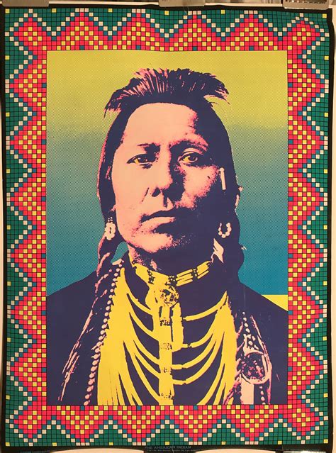
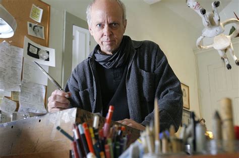
I look at graphic design as communication, meaning that the work has to have a vibe to connect to the viewer or perceiver. I make a black and white drawing and then add color digitally, bringing in a contemporary pattern to the composition to create a vibrance.
Related Quotes
Nowadays, people shoot digitally and it's all in color, but you press a button and it all goes to black and white. But it's not lit for black and white. So, it's a tricky thing. If you're going do black and white, you better remember to separate things with light, because color ain't gonna be there.
The whole basis of working in black and white and grays became the basis of my understanding of color, because it's all about tone, it's all about light and dark. If you don't get that, then your color work is going to be a mess. So that's the beginning of the toolkit: drawing and black and white media.
The impressionistic method leads into a complete splitting and dissolution of all areas involved in the composition, and color is used to create an overall effect of light. The color is, through such a shading down from the highest light in the deepest shadows, sacrified an degraded to a (black-and-white) function. This leads to the destructions of the color as color.
Everything does come from nature. That's where you get new ideas. Just draw the landscape. I felt doing it with a bit of burnt wood was also good because I was drawing burnt wood with a piece of wood. I wanted to do black and white. After using color, I thought black and white would be good. You can have color in black and white. There is color in them, actually.
My popularity has to do with the divorce between modern art, where everything is obscure, and the viewer who often feels he needs a professor to tell them whether it's good or not. I believe a painting has to talk directly to the viewer, with composition, color and design, without a professor to explain it.
...they told me of color, that it was an illusion of the eye, an event in the perceiver's mind, not in the object; they told me that color had no reality; indeed, they told me that color did not inhere in a physical body any more than pain was in a needle. And then they imprisoned me in darkness; and though there was no color there, I still was black, and they still were white; and for that, they bound and gagged me.
What is said determines who listens and who understands. Graphic design is a language, but graphic designers are so busy worrying about the nuances - accents, punctuation and so on - that they spend little time thinking about what the words add up to. I’m interested in using our communication skills to change the way things are.
Black is the absence of all color. White is the presence of all colors. I suppose life must be one or the other. On the whole, though, I think I would prefer color to its absence. But then black does add depth and texture to color. Perhaps certain shades of gray are necessary to a complete palette. Even unrelieved black. Ah, a deep philosophical question. Is black necessary to life, even a happy life? Could we ever be happy if we did not at least occasionally experience misery?
Usually I begin things through a drawing, so a lot of things are worked out in the drawing. But even then, I still allow for and want to make changes. I kind of do the drawing with the painting in mind, but it's very hard to guess at a size or a color and the colors around it and what it will really look like. It's only a guess at the beginning, and then I try to refine it.
