A Quote by Josef Albers

In visual perception a color is almost never seen as it really is - as it physically is. This fact makes color the most relative medium in art. — © Josef Albers
In visual perception a color is almost never seen as it really is - as it physically is. This fact makes color the most relative medium in art.
We never really perceive what color really is, as it physically is. This fact makes color the most relative medium in art.
The aim of our studies is to prove that color is the most relative means of artistic expression, that we never really perceive what color is physically.
For many years, I have been moved by the blue at the far edge of what can be seen, that color of horizons, of remote mountain ranges, of anything far away. The color of that distance is the color of an emotion, the color of solitude and of desire, the color of there seen from here, the color of where you are not. And the color of where you can never go.
The difficulty with color is to go beyond the fact that it's color ? to have it be not just a colorful picture but really be a picture about something. It's difficult. So often color gets caught up in color, and it becomes merly decorative. Some photographers use it brilliantly to make visual statements combining color and content; otherwise it is empty.
The fact is, that of all God's gifts to the sight of man, color, is the holiest, the most divine, the most solemn. We speak rashly of gay color and sad color, for color cannot at once be good and gay. All good color is in some degree pensive, the loveliest is melancholy, and the purest and most thoughtful minds are those which love color the most.
So really what I am trying to do is create and understand form. But then too, color enters into it because a lot of things are color changes without a value change, which wouldn't show up if you were just using a non-color medium.
I'm a visual thinker. With almost all of my writing, I start with something that's visual: either the way someone says something that is visual or an actual visual description of a scene and color.
It seems obvious that colors vary according to lights, because when any color is placed in the shade, it appears to be different from the same color which is located in light. Shade makes color dark, whereas light makes color bright where it strikes.
When I use color, people say, "Oh he's Indian, that's why he's using color!" Perhaps this is true, Indians aren't scared of color, and perhaps that's what makes me different. But also, I personally love color, regardless of where I come from.
When you want full color perception, you must give up preferring some colors and hating others, for you can only hate one aspect of a color, not a whole color, it seems, hate being blind, like 'love.
Red has been praised for its nobility of the color of life. But the true color of life is not red. Red is the color of violence, or of life broken open, edited, and published. Or if red is indeed the color of life, it is so only on condition that it is not seen. Once fully visible, red is the color of life violated, and in the act of betrayal and of waste.
In the work of Seurat, you can see the dots of neutral colors carrying the form and then the dots of more intense color that make the color texture. It is a totally different principle that than of the Impressionists who used broken color to imitate visual effect.
Everybody's going to do the 3D slightly differently the same way that people are going to deal with color differently. Some movies downplay the color, some color is very vibrant. Color design is very different. We've got to think of 3D like color or like sound, as just part of the creative palette that we paint with and not some whole new thing that completely redefines the medium.
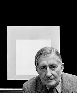
We never really perceive what color is physically!
I don't wear a lot of color. In fact, I don't actually like color on myself. I love color but it's very challenging, it's very powerful, it can overpower you. I think if my eyes were closed and someone put a red jacket on me, I would be able to feel that it was red. I don't feel great in color.
I love color. When I paint, I use a lot of color. I love art that has a vibrancy of color and compositions. I adore the Impressionists, and I'm influenced strongly by them as a self-taught artist.
This site uses cookies to ensure you get the best experience. More info...
Got it!