A Quote by Joshua Reynolds

The distinct blue, red, and yellow colors... though they have not the kind of harmony which is produced by a variety of broken and transparent colors, have the effect of grandeur.
Grandeur of effect is produced by two different ways which seem entirely opposed to each other. One is by reducing the colors to little more than chiaroscuro... and the other, by making the colors very distinct and forcible... but still, the presiding principle of both those manners is simplicity.
It's untrue to say the colors I use are not those of reality. They are real: The red I use is red; the green, green; blue, blue; and yellow, yellow. It's a matter of arranging them differently from the way I find them, but they are always real colors. So it's not true that when I tint a road or a wall, they become unreal. They stay real, though colored differently for my scene.
I like to use really basic or classic colors, things that people have seen over and over and over again. Primary colors, at least in photography, have been around a lot longer than neon colors and really vibrant purples, hot pinks. Red, blue, yellow, orange - because of Kodachrome and the way that things were produced I think that those colors stood out more than any others.
Your playing is like salt water taffy. You see all the beautiful colors, red, yellow, blue, but they all taste the same.
When it comes to our precious poor children of all colors, maybe disproportionally in percentage black and white and red, but all colors, yellow as well as white, we need to push toward integrated schools.
I love a red lip - red is one of my favorite colors, and I really don't wear many other lipstick colors than red.
Red, electric blue - the only color I don't wear is green, which I still don't wear. I wear certain color greens, but I have such yellow skin so I always like to wear bold colors.
Some people hate lime-green; red has all this emotional baggage. Blue seems to be overall one of the more positive colors, and a little more serious than yellow.
It's an enormous amount of work: there are 28 separate buildings, and I work on the choice of the colors for everything. Outside colors, balcony colors, etc.. And all of this has to work together, in harmony.
Art is a creation of a higher order than a copy of nature which is governed by chance.... By the elimination of all muddy colors, by the exclusive use of optical mixture of pure colors, by a methodical divisionism and a strict observation of the scientific theory of colors, the neo-impressionists insures a maximum of luminosity, of color intensity, and of harmony- a result that has never yet been obtained.
Very little thought goes into making this stuff I make. It is on impulse. I think of colors all day and suddenly if I think of ice blue, I wonder if red or yellow will go with it.
Bet you don't know why the sun sets red. You see, light is made up of lots of colors. And out of all those colors, red is the one that travels the farthest.
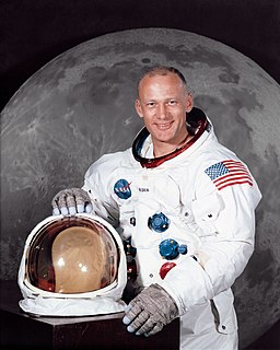
We'll get to the details of what's around here, but it looks like a collection of just about every variety of shape - angularity, granularity, about every variety of rock.... The colors - well.... There doesn't appear to be too much of a general color at all; however, it looks as though some of the rocks and boulders are going to have some interesting colors to them. Over.
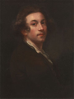
We've been in a war and a recession. That's why acccent colors with yellow and purple are popular. They're optimistic and flirty and happy colors.
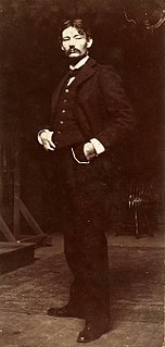
Colors which stand the test of time are Valentino red, white and black. For the festive look, using these colors, you can work with embroidery and sequins to add some bling element to it.
Turquoise, yellow, pink, a lot of the pastel colors are some of the more popular suit colors this year. But it varies from old to young.
This site uses cookies to ensure you get the best experience. More info...
Got it!