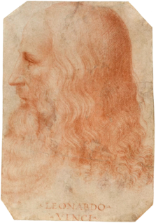
A Quote by Leonardo da Vinci

If you are representing a white body let it be surrounded by ample space, because as white has no colour of its own, it is tinged and altered in some degree by the colour of the objects surrounding it
The prejudice many photographers have against colour photography comes from not thinking of colour as form. You can say things with colour that can't be said in black and white... Those who say that colour will eventually replace black and white are talking nonsense. The two do not compete with each other. They are different means to different ends.
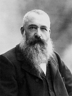
Put a colour upon a canvas - it not only colours with that colour the part of the canvas to which the colour has been applied, but it also colours the surrounding space with the complementary.
The true colour of life is the colour of the body, the colour of the covered red, the implicit and not explicit red of the living heart and the pulses. It is the modest colour of the unpublished blood.
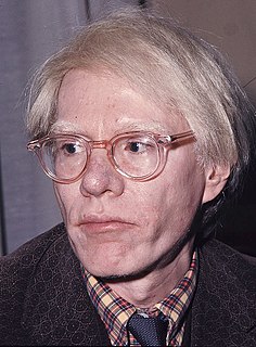
You know, I always say white is not a colour, white is an attitude, and if you haven't got trillions of dollars in the bank that you don't need, you can't be white.
We see in colour all the time. Everything around us is in colour. Black and white is therefore immediately an interpretation of the world, rather than a copy.
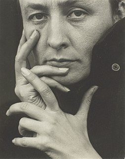
I don't have anything against colour. It is just not my first preference. I have always found black and white photographs to be quieter and more mysterious than those made in colour.
A beautiful feature in the colour wood-cut, and one unique in printing, is colour gradation... Two brushes are sometimes used, one charged with more potent colour than the other. Line blocks are nearly always printed with some variation of tone, and often in colour too.
The colour grey makes you feel uneasy, makes things seem complicated and hopeless, it upsets the notion of black and white. Good and evil? There is no such thing. There is a little good and a evil, a little black and a little white. Grey is not an attractive colour, but perhaps it is the one that describes the world most accurately.
Good colour really means good taste; and 'powerful' colour means a reserve, to give a climax its full force, and not 'red, white, and blue all over.
In the studio, we adhere to a strict colour code. Developed over decades, the colour code consists of a finite and precise colour palate... The whole world as we experience it comes to us through the mystic realm of colour.
Trust your feelings entirely about colour, and then, even if you arrive at no infallible colour theory, you will at least have the credit of having your own colour sense.
It is wonderful how much depends upon the relations of black and white A black and white, if properly balanced, suggests colour.
I had an idea for a story about a young woman who was living with people who were different, not just superficially different - such as hair colour, or eye colour, or skin colour - but different in some significant way.
I work in colour sometimes, but I guess the images I most connect to, historically speaking, are in black and white. I see more in black and white - I like the abstraction of it.
For me, pink or lilac is the colour of innocence, it's the colour of love, it's the colour of everything happy.
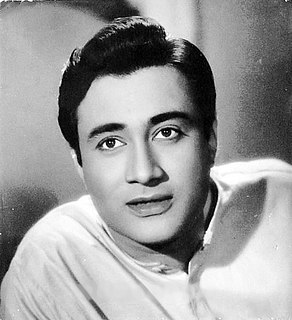
Other black and white films have also been released in colour, but 'Hum Dono' is better than all of them. When you watch 'Hum Dono Rangeen,' you will feel as though it was shot in colour; you won't feel that I have got the reels painted by brush.
This site uses cookies to ensure you get the best experience. More info...
Got it!