A Quote by Nate Berkus

I've always felt that color is intrinsically personal. It evokes a tremendous amount of emotion. If there's a color you respond to, that's something you can incorporate into your home. No one can tell you it's wrong.
For many years, I have been moved by the blue at the far edge of what can be seen, that color of horizons, of remote mountain ranges, of anything far away. The color of that distance is the color of an emotion, the color of solitude and of desire, the color of there seen from here, the color of where you are not. And the color of where you can never go.
Perfect love is to feeling what perfect white is to color. Many think that white is the absence of color. It is not. It is the inclusion of all color. White is every other color that exists, combined. So, too, is love not the absence of an emotion (hatred, anger, lust, jealousy, covetousness), but the summation of all feeling. It is the sum total. The aggregate amount. The everything.
Color in color is felt at any and every place of the pictorial organization; in its immediacy - its particularity. Color must be felt throughout.
The difficulty with color is to go beyond the fact that it's color ? to have it be not just a colorful picture but really be a picture about something. It's difficult. So often color gets caught up in color, and it becomes merly decorative. Some photographers use it brilliantly to make visual statements combining color and content; otherwise it is empty.
My songwriting process is based on a formula: Color, tone, words. When I hear production, I initially identify the color that resonates with me. From there, I am able to translate the color into tone or emotion, which may depend on a number of things.
It trips me out when I hear people say, 'Well, I don't see color.' You see color. Now, how you respond and how you handle the situation once you've seen and noticed color is different.
Color is a powerful physical, biological, and psychological force. When less color and less intense color is present, trace amounts and subtle differences become highly significant and are strongly felt.
My understanding – of course, I’m not a philosopher or a scientist – of an aspect of Goethe’s theory of color is that he felt that color came out of tension between light and dark. I think that is very appropriate when you think about the kind of color that I shoot.
Color is a very personal thing. You need to make sure to choose a color that makes you happy. But I don't recommend accent walls - choose a color you can live with on all four walls.
Dark green is my favorite color. It's the color of nature and the color of money and the color of moss!
There are people who don't respond to color. That's what painting is. It's color.
All students need to know about color is the basic color wheel and complimentary colors. There are many books on color theory; do not waste your time and money.
There really isn't anything that you could call 'bad' color. It all has to do with the amount of color you use and in what context it appears.
The fact is, that of all God's gifts to the sight of man, color, is the holiest, the most divine, the most solemn. We speak rashly of gay color and sad color, for color cannot at once be good and gay. All good color is in some degree pensive, the loveliest is melancholy, and the purest and most thoughtful minds are those which love color the most.
Flowers and flames. And color. Color as color, not as volume or light - only as color.
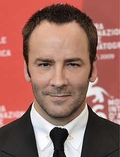
Candy apple red is my favorite color. It's a powerful color to wear. It's always been that way - I've always been really attracted to that color.
This site uses cookies to ensure you get the best experience. More info...
Got it!