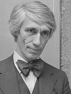
A Quote by Neville Brody

Typography is a hidden tool of manipulation within society. All schools should be teaching typography; we should be fundamentally aware of how typographic language is forming out assholes.
Typography is a hidden tool of manipulation within society.
In a world rife with unsolicited messages, typography must often draw attention to itself before it will be read. Yet in order to be read, it must relinquish the attention it has drawn. Typography with anything to say therefore aspires to a kind of statuesque transparency. It's other traditional goal is durability: not immunity to change, but a clear superiority to fashion. Typography at its best is a visual form of language linking timelessness and time.
If you love it, you don't know much about typography. And if you hate it, you really don't know much about typography either and you should get another hobby.
Readers usually ignore the typographic interface, gliding comfortably along literacy's habitual groove. Sometimes, however, the interface should be allowed to fail. By making itself evident, typography can illuminate the construction and identity of a page, screen, place or product.
For me, typography is a triangular relationship between design idea, typographic elements, and printing technique.
Typography needs to be audible. Typography needs to be felt. Typography needs to be experienced.
Typography has one plain duty before it and that is to convey information in writing. No argument or consideration can absolve typography from this duty.
The better people communicate, the greater will be the need for better typography-expressive typography.
Typography is the craft of endowing human language with a durable visual form, and thus with an independent existence. Its heartwood is calligraphy - the dance, on a tiny stage, of the living, speaking hand - and its roots reach into living soil, though its branches may be hung each year with new machines. So long as the root lives, typography remains a source of true delight, true knowledge, true surprise.
Lyric poetry is, of course, musical in origin. I do know that what happened to poetry in the twentieth century was that it began to be written for the page. When it's a question of typography, why not? Poets have done beautiful things with typography - Apollinaire's 'Calligrammes,' that sort of thing.
Typography is what language looks like.
They should make new ways to better design buildings and books. The computer was the end of Swiss typography!
There should be regulation that prevents all schools, not just state schools, from teaching creationism because it is indoctrination, it is planting ideas into children's heads. We should be teaching children to be much more open-minded.
Typography at its best is a visual form of language linking timelessness and time.
Typography is the craft of endowing human language with a durable visual form.
Typography tended to alter language from a means of perception and exploration to a portable commodity.
This site uses cookies to ensure you get the best experience. More info...
Got it!