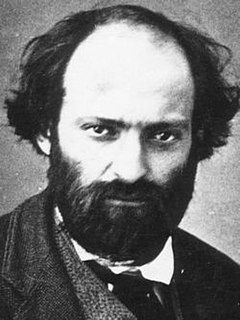
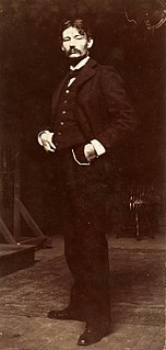
A Quote by Pierre Bonnard

The painter's only solid ground is the palette and colors, but as soon as the colors achieve an illusion, they are no longer judged. — © Pierre Bonnard
The painter's only solid ground is the palette and colors, but as soon as the colors achieve an illusion, they are no longer judged.
Words in the mind are like colors on the palette of the artist. The more colors we have access to, the easier it is to create a captivating picture on the canvas, and the more practice we give to using those many colors appropriately and uniquely, the more likely we will be to create a masterpiece of self expression.
The rainbow is a part of nature, and you have to be in the right place to see it. It's beautiful, all of the colors, even the colors you can't see. That really fit us as a people because we are all of the colors. Our sexuality is all of the colors. We are all the genders, races, and ages.
The starting point of a picture for any painter is a matter of colors and form...I believe that the poetry of art - if that is what one may call it - is a matter of animating these forms and colors.
To me, writing and composing are much more like painting, about colors and brushes; I don't use a computer when I write, and I don't use a piano. I'm at a desk writing, and it's very broad strokes and notes as colors on a palette.
'Color' is quite different from 'colors.' In an image with many colors, we find that all the colors compete with each other rather than interacting with each other. The results" colors.
Repeated similar experiments with adjacent colors will show that any ground subtracts its own hue from colors which it carries and therefore influences.
I like to use really basic or classic colors, things that people have seen over and over and over again. Primary colors, at least in photography, have been around a lot longer than neon colors and really vibrant purples, hot pinks. Red, blue, yellow, orange - because of Kodachrome and the way that things were produced I think that those colors stood out more than any others.
One color alone means nothing. I acts as in a vacuum, with no other colors to relate to. It is only when colors relate to other colors that the fun begins.
Keep it simple: In general, interfaces should use simple geometric forms, minimal contours, and a restricted color palette comprised primarily of less-saturated or neutral colors balanced with a few high contrast accent colors that emphasize important information. Typography should not vary widely in an interface.
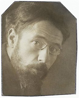
Simultaneous contrast is not just a curious optical phenomenon – it is the very heart of painting. Repeated experiments with adjacent colors will show that any ground subtracts its own hue from the colors which it carries and therefore influences.
Black, white and nude are my essential colors. Each time I start a collection, I start with these colors; they are the elemental colors we refer to from the beginning.
The past is only an unreliable memory held in the present. The future is only a projection of our present conceptions. The present itself vanishes as soon as we try to grasp it. So why bother with attempting to establish an illusion of solid ground?
It's an enormous amount of work: there are 28 separate buildings, and I work on the choice of the colors for everything. Outside colors, balcony colors, etc.. And all of this has to work together, in harmony.
The sensations of colors on the palette can be spiritual experiences.
I use different media, but I still think as a painter. I organize my forms and colors on a screen like a painter does on a canvas.
I use colors that have already been experienced through the light of day and through the state of mind of the total man. In other words, my colors are not colors that are laboratory tools which are isolated from all accidentals or impurities so that they have a specified identity or purity.
This site uses cookies to ensure you get the best experience. More info...
Got it!