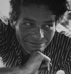
A Quote by Rene Burri

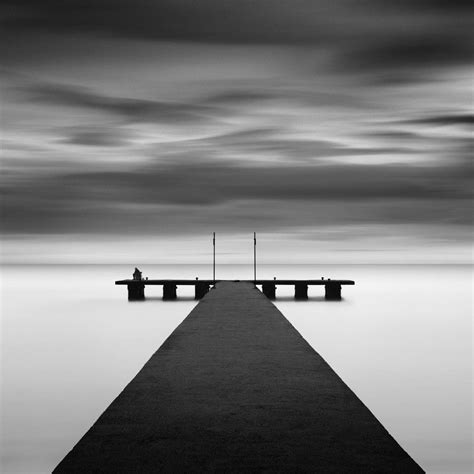
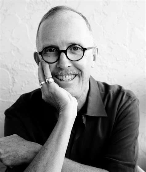
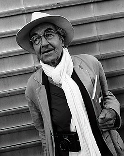
I never had the time or luxury to think about inventing my own colour theory. When colour came, I was interested in expressing things that happened around me in time. — © Rene Burri
I never had the time or luxury to think about inventing my own colour theory. When colour came, I was interested in expressing things that happened around me in time.
Trust your feelings entirely about colour, and then, even if you arrive at no infallible colour theory, you will at least have the credit of having your own colour sense.
We see in colour all the time. Everything around us is in colour. Black and white is therefore immediately an interpretation of the world, rather than a copy.
I became intrigued with colour theory. The absurd pronouncements of the Colour Institute, a group that decides what colours are hot each year or season, amused me.
I had an idea for a story about a young woman who was living with people who were different, not just superficially different - such as hair colour, or eye colour, or skin colour - but different in some significant way.
For me, pink or lilac is the colour of innocence, it's the colour of love, it's the colour of everything happy.
The true colour of life is the colour of the body, the colour of the covered red, the implicit and not explicit red of the living heart and the pulses. It is the modest colour of the unpublished blood.
In the studio, we adhere to a strict colour code. Developed over decades, the colour code consists of a finite and precise colour palate... The whole world as we experience it comes to us through the mystic realm of colour.
I'm interested in colour-blind hiring of directors, producers, and writers. Go to the source. Then we won't need to have conversations about colour-blind casting.
A beautiful feature in the colour wood-cut, and one unique in printing, is colour gradation... Two brushes are sometimes used, one charged with more potent colour than the other. Line blocks are nearly always printed with some variation of tone, and often in colour too.
The prejudice many photographers have against colour photography comes from not thinking of colour as form. You can say things with colour that can't be said in black and white... Those who say that colour will eventually replace black and white are talking nonsense. The two do not compete with each other. They are different means to different ends.
I sometimes ask myself how it came about that I was the one to develop the theory of relativity. The reason, I think, is that a normal adult never stops to think about problems of space and time. These are things which he has thought about as a child. Bu t my intellectual development was retarded,as a result of which I began to wonder about space and time only when I had already grown up.
Every time I have to try on a wig for work, I get excited about the colour; I've often thought about going for a platinum bob or also raven black, as it looks so great against pale skin. But I always end up being loyal to my red colour.
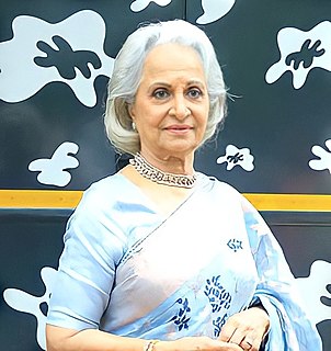
When 'Chaudhvin Ka Chand' was released, it was a big success and very well appreciated. At that time, colour films had just started to be made, and Guru Dutt decided to take the title song of the film, shoot it in colour and rerelease it with new fanfare.
[Malcolm Fraser] went straight from Melbourne Grammar to Oxford. And he would have been a very lonely person, and I think he probably met a lot of black students there who were also probably lonely. I think he formed friendships with them, which established his judgement about the question of colour. That’s my theory. I don’t know whether it’s right or not, but that’s what I always respected about Malcolm. He was absolutely, totally impeccable on the question of race and colour.
Sometimes I can see colour without opening my eyes. I saw that Billy's heart was no colour and every colour. Like water or diamonds or crystals, it's pure and reflects the light.
I first came up with the idea for the colour-chart pictures back in 1966, and my preoccupation with the topic culminated in 1974 with a painting that consisted of 4,096 colour fields. Initially I was attracted by the typical Pop Art aestheticism of using standard colour-sample cards; I preferred the unartistic, tasteful and secular illustration of the different tones to the paintings of Albers, Bill, Calderara, Lohse, etc.
This site uses cookies to ensure you get the best experience. More info...
Got it!