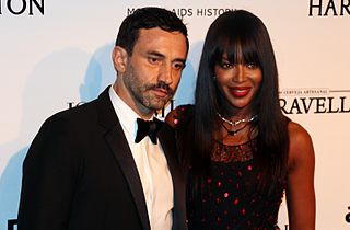
A Quote by Riccardo Tisci
Black is always elegant. It is the most complete colour in the whole world, made of all the colours in the palette.
Related Quotes
Based on mixtures of the three primary colours, along with black and white, I come up with a certain number of possible colours and, by multiplying these by two or four, I obtain a definite number of colour fields that I multiply yet again by two, etc. But the complete realization of this project demands a great deal of time and work.
Fred didn't have a favourite colour. He was just pleased that he could see all of the colours in the colour chart. That was his wish for everyone. Fred wanted people to experience the joy of seeing vivid colours - in nature: the greens and browns of the mountains; in their work: the orange, red and black of the back of the retina; and in life.
I often use colour to attack form, to break it down a little or begin to dissolve it. But I am not at all interested in 'pure' colour or in colour as a transcendental presence... So if I use colours to begin to dissolve forms, I also use forms to prevent colours becoming entirely detached from their everyday existence.
The intellectual attainments of a man who thinks for himself resemble a fine painting, where the light and shade are correct, the tone sustained, the colour perfectly harmonised; it is true to life. On the other hand, the intellectual attainments of the mere man of learning are like a large palette, full of all sorts of colours, which at most are systematically arranged, but devoid of harmony, connection and meaning.
Black is the absence of all color. White is the presence of all colors. I suppose life must be one or the other. On the whole, though, I think I would prefer color to its absence. But then black does add depth and texture to color. Perhaps certain shades of gray are necessary to a complete palette. Even unrelieved black. Ah, a deep philosophical question. Is black necessary to life, even a happy life? Could we ever be happy if we did not at least occasionally experience misery?
Turning to the colour-classification methodology: The starting point are the four pure colours red, yellow, green and blue; their in-between shades and scales of brightness result in colour schemes containing 16, 64, 256 and 1,024 shades. More colours would be pointless because it wouldn't be possible to distinguish between them clearly.
The prejudice many photographers have against colour photography comes from not thinking of colour as form. You can say things with colour that can't be said in black and white... Those who say that colour will eventually replace black and white are talking nonsense. The two do not compete with each other. They are different means to different ends.
