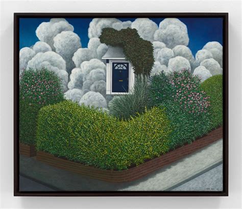
A Quote by Scott Kahn
Color, like everything else concerning visual expression, usually boils down to a gift, an innate sensibility and sensitivity. Ultimately, artists develop their own palette and color sense.
Related Quotes
I've always thought for myself, that's something I want to focus on - color palette and the use of color. Rather than using it in a way that other makeup artists might, I try to enhance the color palette with the girl to really bring out her sickest features and make her look absolutely the best she can.
Everybody's going to do the 3D slightly differently the same way that people are going to deal with color differently. Some movies downplay the color, some color is very vibrant. Color design is very different. We've got to think of 3D like color or like sound, as just part of the creative palette that we paint with and not some whole new thing that completely redefines the medium.
The difficulty with color is to go beyond the fact that it's color ? to have it be not just a colorful picture but really be a picture about something. It's difficult. So often color gets caught up in color, and it becomes merly decorative. Some photographers use it brilliantly to make visual statements combining color and content; otherwise it is empty.
The color palette grew as the story progressed. The 1920's sharecroppers were muted and neutrals, the 30's and 40's introduced burgundy to the neutral palette. The 1950's introduced green, black and denim blue, the 1960's introduced orange and heavier more saturated color, the 1970's introduced more primaries, and the fashion palette became more recognizable as a contemporary one from there.
For many years, I have been moved by the blue at the far edge of what can be seen, that color of horizons, of remote mountain ranges, of anything far away. The color of that distance is the color of an emotion, the color of solitude and of desire, the color of there seen from here, the color of where you are not. And the color of where you can never go.
I can't separate the process of writing from the visual process. I'm speaking only for myself here, but I'm a highly visual writer. In my imagination, when I'm thinking of a scene, I think of every last detail of it: The space, the color palette, the blocking of the actors, the placement of the camera.
The impressionistic method leads into a complete splitting and dissolution of all areas involved in the composition, and color is used to create an overall effect of light. The color is, through such a shading down from the highest light in the deepest shadows, sacrified an degraded to a (black-and-white) function. This leads to the destructions of the color as color.
