A Quote by Ta-Nehisi Coates
The standard progressive approach of the moment is to mix color-conscious moral invective with color-blind public policy.
Related Quotes
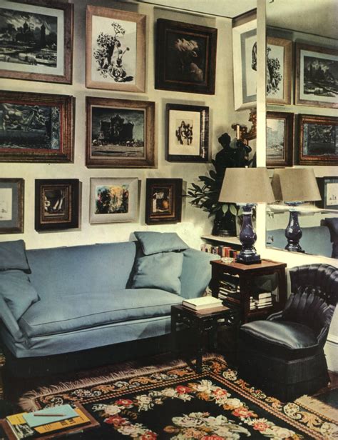
For many years, I have been moved by the blue at the far edge of what can be seen, that color of horizons, of remote mountain ranges, of anything far away. The color of that distance is the color of an emotion, the color of solitude and of desire, the color of there seen from here, the color of where you are not. And the color of where you can never go.
The specter of color is apparent even when it goes unmentioned, and it is all too often the unseen force that influences public policy as well as private relationships. There is nothing more remarkable than the ingenuity that the various demarcations of the color line reflect. If only the same creative energy could be used to eradicate the color line; then its days would indeed be numbered.
I suppose the most marked example of color as structure is in the Byzantine use of mosaic decoration that becomes architecture. The decoration of the interiors so related to the form that they fuse. In less elaborate interior design this is always the ideal approach to color - used not only as just color alone.
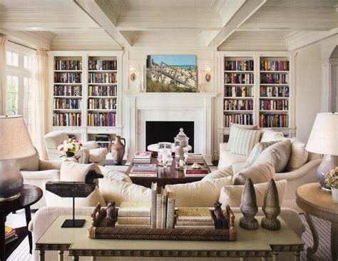
During college, when I was working full time for my father [the decorator Mark Hampton], I rented an apartment and I just couldn't take time off to paint it. So I went there one evening and stayed up all night painting the place what I thought was a lovely pale yellow. When the sun came up, I realized I'd painted the walls the color of insanity. I had to immediately mix in all my trim color to tone it down. Yellow is an electric color and wholly misleading. It becomes more yellow with the sun's yellow light on it. The moral is, even if you think your yellow is the one, go paler.
The fact is, that of all God's gifts to the sight of man, color, is the holiest, the most divine, the most solemn. We speak rashly of gay color and sad color, for color cannot at once be good and gay. All good color is in some degree pensive, the loveliest is melancholy, and the purest and most thoughtful minds are those which love color the most.
