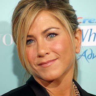
A Quote by Tamzin Merchant

My favourite colour is red, but I also like jewel tones and monochrome, while my preferred shapes include A-line skirts and skinny trousers. — © Tamzin Merchant
My favourite colour is red, but I also like jewel tones and monochrome, while my preferred shapes include A-line skirts and skinny trousers.
I love earth tones, jewel tones and everything that is natural. I also like natural materials like cottons, silks... I don't like synthetic. Even the wood we use has to be authentic.
I first came up with the idea for the colour-chart pictures back in 1966, and my preoccupation with the topic culminated in 1974 with a painting that consisted of 4,096 colour fields. Initially I was attracted by the typical Pop Art aestheticism of using standard colour-sample cards; I preferred the unartistic, tasteful and secular illustration of the different tones to the paintings of Albers, Bill, Calderara, Lohse, etc.
The true colour of life is the colour of the body, the colour of the covered red, the implicit and not explicit red of the living heart and the pulses. It is the modest colour of the unpublished blood.
In Asia, red is the colour of joy; red is the colour of festivities and of celebration. In Chinese culture, blue is the colour of mourning.
I do love the provocative side of my collection, but I also like the classics - the simpler skirts and the sweater sets and the shirtdresses. And I always love to see girls in jackets and trousers.
I'm crazily organised with my wardrobe. Everything is hung in categories: dresses, jackets, shirts, skirts and trousers are all hung in order, and they're then hung in colour order, too, so that when I'm looking for something I know exactly where it is.
According to research,when given a choice, babies choose gold. It's my favourite colour after black and red.
Comrade Blade Nzimande is complaining that EFF stole the ‘red colour’, he does not have a copyright on the ‘red colour’. There’s nothing we can steal from him because he has nothing but that skuurpot (pot scourer) face of his. Why didn’t he complain when Vodacom was red?
Fred didn't have a favourite colour. He was just pleased that he could see all of the colours in the colour chart. That was his wish for everyone. Fred wanted people to experience the joy of seeing vivid colours - in nature: the greens and browns of the mountains; in their work: the orange, red and black of the back of the retina; and in life.
I feel in colour, strong tones that I hue down for the comfort of the pastelly inclined. Beige and magnolia and a hint of pink are what the well-decorated heart is wearing; who wants my blood red and vein-blue?
If tone is granted to be subjected to control, why not line also, which has equal emotional significance? And if line, why not shapes and forms? And if shapes and forms, why not allow elision or emphasis of detail? And if all these things are allowed, what becomes of the record of actuality ?... Sunk without a trace!
If you like I'll be furious flesh elemental, or- changing to tones that the sunset arouses- if you like- I'll be extraordinary gentle, not a man but - a cloud in trousers.
The first colour charts were unsystematic. They were based directly on commercial colour samples. They were still related to Pop Art. In the canvases that followed, the colours were chosen arbitrarily and drawn by chance. Then, 180 tones were mixed according to a given system and drawn by chance to make four variations of 180 tones. But after that the number 180 seemed too arbitrary to me, so I developed a system based on a number of rigorously defined tones and proportions.

One of the color combos that I really love is the tones of technicolor, which older movies would have, these tones of blue and red in them.
Pink is my favourite colour. I used to say my favourite colour was black to be cool, but it is pink - all shades of pink. If I have an accessory, it is probably pink.
A beautiful feature in the colour wood-cut, and one unique in printing, is colour gradation... Two brushes are sometimes used, one charged with more potent colour than the other. Line blocks are nearly always printed with some variation of tone, and often in colour too.
This site uses cookies to ensure you get the best experience. More info...
Got it!