A Quote by Van Day Truex
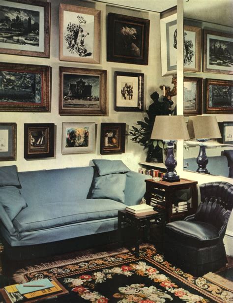
I wonder if any element of interior design is more personal than color? Nothing can more quicly reveal aspect of personality and character than the choice - or absence - of color.
Related Quotes
I like black for clothes, small items, and jewelry. It's a color that can't be violated by any other colors. A color that simply keeps being itself. A color that sinks more somberly than any other color, yet asserts itself more than all other colors. It's a passionate gallant color. Anything is wonderful if it transcends things rather than being halfway.
As my friend Jeremy Gilbert-Rolfe has argued persuasively, there is an element of positivity in the visible world, and in color particularly, that totally eludes the historicity of language, with its protocols of absence and polarity. The color red, as an attribute of the world, is always there. It is something other than the absence of yellow and blue--and, thus, when that red becomes less red, it becomes more one or the other. It never exists in a linguistic condition of degradation or excess that must necessarily derive from our expectations.
I suppose the most marked example of color as structure is in the Byzantine use of mosaic decoration that becomes architecture. The decoration of the interiors so related to the form that they fuse. In less elaborate interior design this is always the ideal approach to color - used not only as just color alone.
...they told me of color, that it was an illusion of the eye, an event in the perceiver's mind, not in the object; they told me that color had no reality; indeed, they told me that color did not inhere in a physical body any more than pain was in a needle. And then they imprisoned me in darkness; and though there was no color there, I still was black, and they still were white; and for that, they bound and gagged me.
The specter of color is apparent even when it goes unmentioned, and it is all too often the unseen force that influences public policy as well as private relationships. There is nothing more remarkable than the ingenuity that the various demarcations of the color line reflect. If only the same creative energy could be used to eradicate the color line; then its days would indeed be numbered.
Perfect love is to feeling what perfect white is to color. Many think that white is the absence of color. It is not. It is the inclusion of all color. White is every other color that exists, combined. So, too, is love not the absence of an emotion (hatred, anger, lust, jealousy, covetousness), but the summation of all feeling. It is the sum total. The aggregate amount. The everything.
