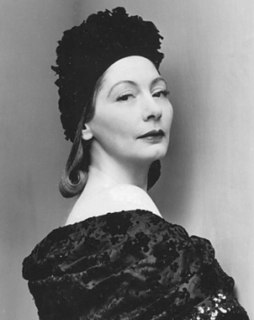
A Quote by Van Day Truex

How obvious it is that color has its various connotations-hue, value, and intensity - and without the basic understanding of these three determining factors, we are somewhat limited in the proper use of color in rooms.
Hue does not refer to how light, dark, or intense, but only what kind of color: what hue. It takes all three aspects to make a color, therefore 'red' is not a color, but only one aspect, the hue, of some partially defined color.
Color is a major element in scale. A small room can have a larger look by the use of closely related values, hues, and intensity. A large room can be made to look smaller by marked contrasts of color and value, hue, and intensity. Value is one of the most important elements. Whether light or dark, little value contrast makes for unity, and sharper contrast makes for stronger punctuation.
It is general knowledge for anyone interested in color that subdued value, intensity and hue make for quieter, less adventuresome interiors. Stronger approaches need stronger knowledge, more experience and flair.
So really what I am trying to do is create and understand form. But then too, color enters into it because a lot of things are color changes without a value change, which wouldn't show up if you were just using a non-color medium.
All students need to know about color is the basic color wheel and complimentary colors. There are many books on color theory; do not waste your time and money.
The difficulty with color is to go beyond the fact that it's color ? to have it be not just a colorful picture but really be a picture about something. It's difficult. So often color gets caught up in color, and it becomes merly decorative. Some photographers use it brilliantly to make visual statements combining color and content; otherwise it is empty.
For many years, I have been moved by the blue at the far edge of what can be seen, that color of horizons, of remote mountain ranges, of anything far away. The color of that distance is the color of an emotion, the color of solitude and of desire, the color of there seen from here, the color of where you are not. And the color of where you can never go.
When I use color, people say, "Oh he's Indian, that's why he's using color!" Perhaps this is true, Indians aren't scared of color, and perhaps that's what makes me different. But also, I personally love color, regardless of where I come from.
It seems obvious that colors vary according to lights, because when any color is placed in the shade, it appears to be different from the same color which is located in light. Shade makes color dark, whereas light makes color bright where it strikes.
Color is life, for a world without color seems dead. As a flame produces light, light produces color. As intonation lends color to the spoken word, color lends spiritually realized sound to a form.
Painting is drawing, with the additional means of color. Painting without drawing is just 'coloriness,' color excitement. To think of color for color's sake is like thinking of sound for sound's sake. Color is like music. The palette is an instrument that can be orchestrated to build form.
My understanding – of course, I’m not a philosopher or a scientist – of an aspect of Goethe’s theory of color is that he felt that color came out of tension between light and dark. I think that is very appropriate when you think about the kind of color that I shoot.
I love color. When I paint, I use a lot of color. I love art that has a vibrancy of color and compositions. I adore the Impressionists, and I'm influenced strongly by them as a self-taught artist.
Dark green is my favorite color. It's the color of nature and the color of money and the color of moss!
It trips me out when I hear people say, 'Well, I don't see color.' You see color. Now, how you respond and how you handle the situation once you've seen and noticed color is different.
I don't think paper will go away. I do believe that the value of paper will change, and Xerox is working on changing that value. Consider a color page. Actual life is in color, but you keep reproducing it in black and white. You remove value. It's a bad thing to do.
This site uses cookies to ensure you get the best experience. More info...
Got it!