A Quote by Van Day Truex
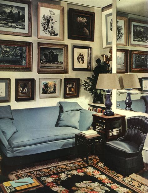
I suppose the most marked example of color as structure is in the Byzantine use of mosaic decoration that becomes architecture. The decoration of the interiors so related to the form that they fuse. In less elaborate interior design this is always the ideal approach to color - used not only as just color alone.
Related Quotes
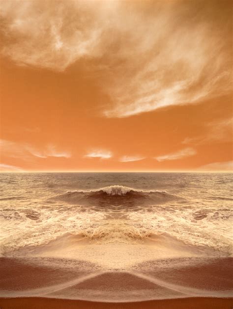
The difficulty with color is to go beyond the fact that it's color ? to have it be not just a colorful picture but really be a picture about something. It's difficult. So often color gets caught up in color, and it becomes merly decorative. Some photographers use it brilliantly to make visual statements combining color and content; otherwise it is empty.
The fact is, that of all God's gifts to the sight of man, color, is the holiest, the most divine, the most solemn. We speak rashly of gay color and sad color, for color cannot at once be good and gay. All good color is in some degree pensive, the loveliest is melancholy, and the purest and most thoughtful minds are those which love color the most.
For many years, I have been moved by the blue at the far edge of what can be seen, that color of horizons, of remote mountain ranges, of anything far away. The color of that distance is the color of an emotion, the color of solitude and of desire, the color of there seen from here, the color of where you are not. And the color of where you can never go.
Most eyes have more than one color, but usually they're related. Blue eyes may have two shades of blue, or blue and gray, or blue and green, or even a fleck or two of brown. Most people don't notice that. When I first went to get my state ID card, the form asked for eye color. I tried to write in all the colors in my own eyes, but the space wasnt big enough. They told me to put 'brown'. I put 'brown', but that is not the only color in my eyes. It is just the color that people see because they do not really look atr other people's eyes.
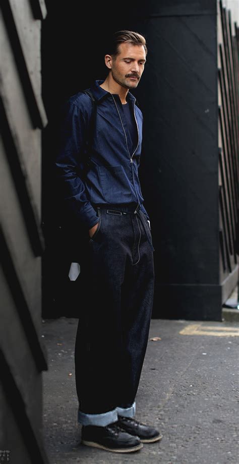
The whole point is that colors that are harder to wear, like pink, less expected, or maybe not as commercial; if they're used in the right way, they can make a design way more compelling, especially in menswear where color isn't often used. I think it's really exciting to have a lot of color in men's stuff.
Everybody's going to do the 3D slightly differently the same way that people are going to deal with color differently. Some movies downplay the color, some color is very vibrant. Color design is very different. We've got to think of 3D like color or like sound, as just part of the creative palette that we paint with and not some whole new thing that completely redefines the medium.
