A Quote by Wassily Kandinsky
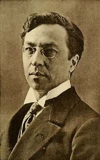
I let myself go. I thought little of the houses and trees, but applied colour stripes and spots to the canva... Within me sounded the memory of early evening in Moscow, before my eyes was the strong, colour-saturated scale of the Munich light and atmosphere, which thundered deeply in the shadows.
Related Quotes
I have gained very great inspiration from the Cornish land- and seascape, the horizontal line of the sea and the quality of light and colour which reminds me of the Mediterranean light and colour which so excites one's sense of form; and first and last there is the human figure which in the country becomes a free and moving part of a greater whole. This relationship between figure and landscape is vitally important to me. I cannot feel it in a city.
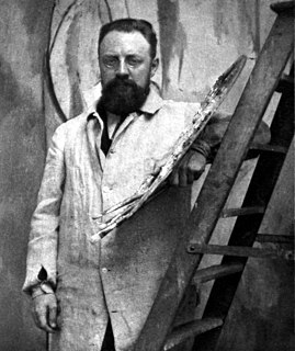
Colour, as the strange and magnificent expression of the inscrutable spectrum of Eternity, is beautiful and important to me as a painter; I use it to enrich the canvas and to probe more deeply into the object. Colour also decided, to a certain extent, my spiritual outlook, but it is subordinated to life, and above all, to the treatment of form. Too much emphasis on colour at the expense of form and space would make a double manifestation of itself on the canvas, and this would verge on craft work.
I wouldn't know what to do with [colour]. Colour to me is too real. It's limiting. It doesn't allow too much of a dream. The more you throw black into a colour, the more dreamy it gets… Black has depth. It's like a little egress; you can go into it, and because it keeps on continuing to be dark, the mind kicks in, and a lot of things that are going on in there become manifest. And you start seeing what you're afraid of. You start seeing what you love, and it becomes like a dream.
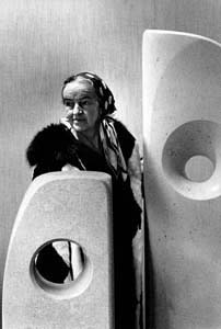
There is an infinity of landscape here, caused by the purity of the atmosphere. It has been said that there is a lack of colour. It is not so obvious as the greenness of England, but it is infinitely more varied and more delicate in tone. The landscape is a pinky mauve, a lilac, and the reflection of the sun of the particles of the atmosphere is a warm amber. So I should say our colour scheme is amber and lilac.
The colour blue - that is my colour - and the colour blue means you have left the drabness of day-to-day reality to be transported into - not a world of fantasy, it’s not a world of fantasy - but a world of freedom where you can say what you like and what you don’t like. This has been expressed forever by the colour blue, which is really sky blue.
