A Quote by Hilary Farr
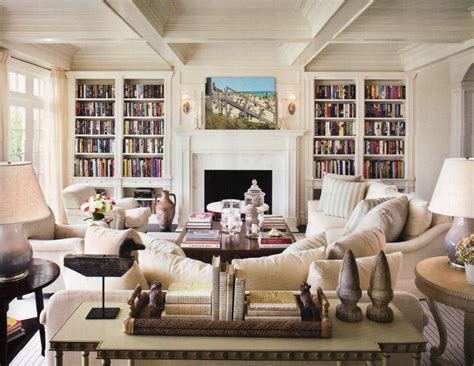
In a small powder room, the inclination is to go with a light wall color. My trick is to do the opposite - such as a patterned wallpaper or a deep color on the walls. It's more interesting and makes a design statement.
Related Quotes
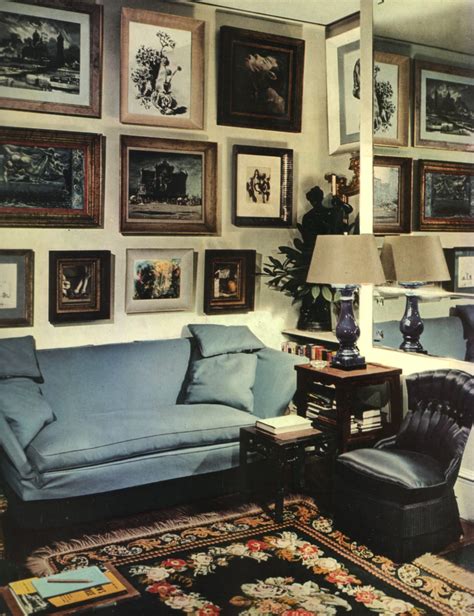
Color is a major element in scale. A small room can have a larger look by the use of closely related values, hues, and intensity. A large room can be made to look smaller by marked contrasts of color and value, hue, and intensity. Value is one of the most important elements. Whether light or dark, little value contrast makes for unity, and sharper contrast makes for stronger punctuation.
From when I was a really small girl on, I would pick every fabric, every color on the walls, and I was always redecorating. Like once every couple of months I would redecorate my room. I had a full wall that was all collage - the entire wall - when I was in junior high. And then it would kind of morph with me as I was growing.
For many years, I have been moved by the blue at the far edge of what can be seen, that color of horizons, of remote mountain ranges, of anything far away. The color of that distance is the color of an emotion, the color of solitude and of desire, the color of there seen from here, the color of where you are not. And the color of where you can never go.
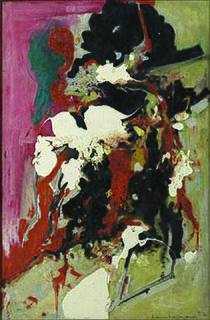
The impressionistic method leads into a complete splitting and dissolution of all areas involved in the composition, and color is used to create an overall effect of light. The color is, through such a shading down from the highest light in the deepest shadows, sacrified an degraded to a (black-and-white) function. This leads to the destructions of the color as color.
During college, when I was working full time for my father [the decorator Mark Hampton], I rented an apartment and I just couldn't take time off to paint it. So I went there one evening and stayed up all night painting the place what I thought was a lovely pale yellow. When the sun came up, I realized I'd painted the walls the color of insanity. I had to immediately mix in all my trim color to tone it down. Yellow is an electric color and wholly misleading. It becomes more yellow with the sun's yellow light on it. The moral is, even if you think your yellow is the one, go paler.
I like black for clothes, small items, and jewelry. It's a color that can't be violated by any other colors. A color that simply keeps being itself. A color that sinks more somberly than any other color, yet asserts itself more than all other colors. It's a passionate gallant color. Anything is wonderful if it transcends things rather than being halfway.
