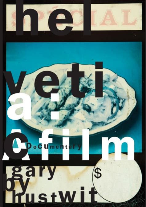
Anyone who uses Helvetica knows nothing about typefaces.
I guess if there was a desert island scenario and I only could take one font with me, I guess it would be Helvetica, though it has it's limitations, I think it's incredibly versatile and gets the job done and I also think it's one of the typefaces that will really survive the test of time beyond the next several decades if not into the next century.
I remember a time at Yale when my work was being critiqued by Paul Rand. Mr. Rand told me only to use Helvetica as a display face never in text, then he squinted, leaned in, and whispered in my ear, "because Helvetica looks like dogshit in text".
The meaning is in the content of the text and not in the typeface, and that is why we loved Helvetica very much.
Lower case Ss are notoriously difficult to get right. But in Helvetica it's not straight - you want to go in there and tighten it up. And the 'a' looks so woolly and ill-conceived, it really winds me up.
If you have no intuitive sense of design, then call yourself an "information architect" and only use Helvetica.
Helvetica is the jeans, and Univers the dinner jacket. Helvetica is here to stay.
And Helvetica maybe says everything, and that's perhaps part of its appeal.
If you think of ice cream, it (Helvetica) is a cheap, nasty, supermarket brand made of water, substitutes and vegetable fats. The texture is wrong and it leaves a little bit of a funny aftertaste.
I discovered that I never really used Helvetica but I like to look at it. I like the VW beetle, too, although I've never driven one.
Helvetica was a real step from the 19th century typeface... We were impressed by that because it was more neutral, and neutralism was a word that we loved. It should be neutral. It shouldn't have a meaning in itself. The meaning is in the content of the text and not in the typeface.
This site uses cookies to ensure you get the best experience.
More info...