Top 70 Typography Quotes & Sayings

Explore popular Typography quotes.
Last updated on November 21, 2024.
Typography must be as beautiful as a forest, not like the concrete jungle of the tenements It gives distance between the trees, the room to breathe and allow for life.
If your words aren't truthful, the finest optically letter-spaced typography won't help.
Simplicity, wit, and good typography. — © Michael Bierut
Simplicity, wit, and good typography.
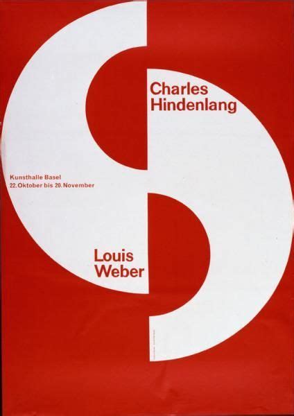
They should make new ways to better design buildings and books. The computer was the end of Swiss typography!
Of the many unforeseen consequences of typography, the emergence of nationalism is, perhaps, the most familiar
Typography has one plain duty before it and that is to convey information in writing. No argument or consideration can absolve typography from this duty.
Why do only the Latin script when Nokia has a billion consumers? Typography is the bedrock of communication; it can really connect people.
Typography is what language looks like.
The book, that stubbornly unelectric artifact of pure typography, possesses resources conducive to the flourishing of the soul. A thoughtful reading of the printed text orients one to a world of order, meaning, and the possibility of knowing truth.
Good typography, first, makes words readable. At its best, it does something more: it helps express the animating spirit of the ideas behind the words.
I haven't studied art and I haven't studied typography, but I've still gone out and done it.
Typography can be as exciting as illustration and photography.
I was always fascinated by graphic art and typography and architecture. And so I was constantly cutting things and making blocks and making buildings out of shoeboxes.
Readers usually ignore the typographic interface, gliding comfortably along literacy's habitual groove. Sometimes, however, the interface should be allowed to fail. By making itself evident, typography can illuminate the construction and identity of a page, screen, place or product.
The contributions that one makes in typography, design, and art in general cannot be, and must not be measured on how much money is involved. That would lead to total chaos. The word itself (contribution) is to give to a common purpose.
Typography at its best is a visual form of language linking timelessness and time. — © Robert Bringhurst
Typography at its best is a visual form of language linking timelessness and time.
There are bad types and good types, and the whole science and art of typography begins after the first category has been set aside.
The material of typography is the black, and it is the designer’s task with the help of this black to capture space, to create harmonious whites inside the letters as well as between them.
I learned about serif and san serif typefaces, about varying the amount of space between different letter combinations, about what makes great typography great. It was beautiful, historical, artistically subtle in a way that science can't capture, and I found it fascinating.
Typography is a minor technicality of civilized life.
Typography is to literature as musical performance is to composition: an essential act of interpretation, full of endless opportunities for insight or obtuseness.
This project started nearly twenty years ago as an assignment in my typography class at art school. Students were encouraged to see letters beyond their dull, practical functionality. We played with their unique shapes and tinkered with their infinite possibilities. The challenge was hard, so the reward of “cracking” a word felt great. This became a lifelong project for me.
You can do a good ad without good typography, but you can't do a great ad without good typography.
Lyric poetry is, of course, musical in origin. I do know that what happened to poetry in the twentieth century was that it began to be written for the page. When it's a question of typography, why not? Poets have done beautiful things with typography - Apollinaire's 'Calligrammes,' that sort of thing.
Typography is the craft of endowing human language with a durable visual form, and thus with an independent existence. Its heartwood is calligraphy - the dance, on a tiny stage, of the living, speaking hand - and its roots reach into living soil, though its branches may be hung each year with new machines. So long as the root lives, typography remains a source of true delight, true knowledge, true surprise.
In a world rife with unsolicited messages, typography must often draw attention to itself before it will be read. Yet in order to be read, it must relinquish the attention it has drawn. Typography with anything to say therefore aspires to a kind of statuesque transparency. It's other traditional goal is durability: not immunity to change, but a clear superiority to fashion. Typography at its best is a visual form of language linking timelessness and time.
Copy, art, and typography should be seen as a living entity; each element integrally related, in harmony with the whole, and essential to the execution of an idea.
Typography is the craft of endowing human language with a durable visual form.
Perfect typography is more a science than an art.
Designers provide ways into—and out of—the flood of words by breaking up text into pieces and offering shortcuts and alternate routes through masses of information. (...) Although many books define the purpose of typography as enhancing the readability of the written word, one of design’s most humane functions is, in actuality, to help readers avoid reading.
I used to draw and do a lot of calligraphy and typography. I'm a big sketcher, too.
Typography fostered the modern idea of individuality, but it destroyed the medieval sense of community and integration.
You could say that bad typography brought us the Afghanistan war, the Iraq war, the housing crisis and a good number of other things.
Perfect typography is certainly the most elusive of all arts. Sculpture in stone alone comes near it in obstinacy.
The first thing one learns about typography & type design is that these rules are made to be broken.
Typography is not only a technology but is in itself a natural resource or staple, like cotton or timber or radio; and, like any staple, it shapes not only private sense ratios but also patterns of communal interdependence.
If typography is calling attention to itself, it's taking that attention away from what the words are saying.
Space in typography is like time in music. It is infinitely divisible, but a few proportional intervals can be much more useful than a limitless choice of arbitrary quantities.
Discipline in typography is a prime virtue. Individuality must be secured by means that are rational. Distinction needs to be won by simplicity and restraint. It is equally true that these qualities need to be infused wiht a certain spirit and vitality, or they degenerate into dullness and mediocrity.
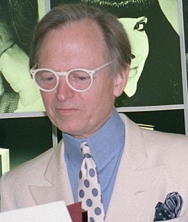
I found a great many pieces of punctuation and typography lying around dormant when I came along - and I must say I had a good time using them. — © Tom Wolfe
I found a great many pieces of punctuation and typography lying around dormant when I came along - and I must say I had a good time using them.
There is nothing simple or dull in achieving the transparent page. Vulgar ostentation is twice as easy as discipline. When you realise that ugly typography never effaces itself, you will be able to capture beauty as the wise men capture happiness by aiming at something else.
Malevich, Lissitsky, Kandinsky, Tatlin, Pevsner, Rodchenko... all believed in the social role of art... Their works were like hinged doors, connecting activity with activity. Art with engineering; music with painting; poetry with design; fine art with propaganda; photographs with typography; diagrams with action; the studio with the street.
I was never really satisfied with writing only text or with the way my texts looked when they were published. Most online journals have a pretty lame sense of typography - bad font, counter-intuitive margins and line spacing - that it makes me sour on my writing.
The better people communicate, the greater will be the need for better typography-expressive typography.
Typography is a hidden tool of manipulation within society. All schools should be teaching typography; we should be fundamentally aware of how typographic language is forming out assholes.
If you love it, you don't know much about typography. And if you hate it, you really don't know much about typography either and you should get another hobby.
For me, typography is a triangular relationship between design idea, typographic elements, and printing technique.
There's a simplicity in typography that demands absolute accuracy... the only way you can experience it is by doing it, and you can't do it on a screen because a screen never gives you the entire picture.
Everyone complains that we can no longer intake huge chunks of text. I find that a reason to celebrate. It's something that has deep roots in modernism, stretching from the Futurists' use of typography to Pound's use of ideograms to concrete poetry.
Typography is a hidden tool of manipulation within society.
I was a generalist in college. You take a lot of courses to feel out what you're interested in. I really felt web design was too limited for me to interested in it - [instead] I was really into typography.
Old typography or letter woodblocks that are hand-carved, cracked, and worn are especially beautiful. I love that aged, handmade effect, and that's why I don't muck around much with Photoshop.
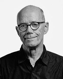
I'm very much a word person, so that's why typography for me is the obvious extension. It just makes my words visible. — © Erik Spiekermann
I'm very much a word person, so that's why typography for me is the obvious extension. It just makes my words visible.
Just as typography is human speech translated into what can be read, so photography is the translation of reality into a readable image.
We use the word typography to describe two different things: the design of letterforms, and the layout of typeset passages on a page. Both of those experiences are really important to communicating information, especially when that information involves complex ideas.
Typography needs to be audible. Typography needs to be felt. Typography needs to be experienced.
Typography exists to honor content.
To say a grid is limiting is to say that language is limiting, or typography is limiting. It is up to us to use these media critically or passively.
Typography tended to alter language from a means of perception and exploration to a portable commodity.
We have thought carefully about how our use of typography, colour, and images can support and enhance 'Guardian' journalism. We have introduced a font called Guardian Headline that is simple, confident, and impactful.
This site uses cookies to ensure you get the best experience. More info...
Got it!