A Quote by Luc Besson
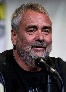
That's the storyboard that we have in the beginning [of Valerian]. It's an easy shot. It's just a spaceship coming in. That's the first layout. On the first layout, we see the timing of the shot and the speed. It starts to get some shadows, and we see that everything is moving in the back.
Related Quotes
I've always liked a formal layout and informal planting," she explained. "First get the structure right, like the bones in a face, then plant it like a crowded shoe. If you have a strong layout, you can let the plants seed themselves all over the place. Haphazard, unexpected... I like to be surprised by a garden.
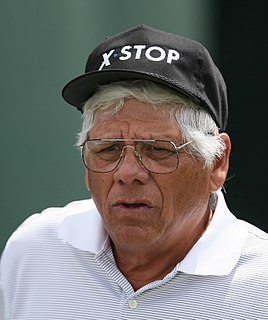
Every shot feels like the first shot of the day. If I'm on the range hitting shot after shot, I can hit them just as good as I did when I was 30. But out on the course, your body changes between shots. You get out of the cart, and you've got this 170-yard 5-iron over a bunker, and it goes about 138.
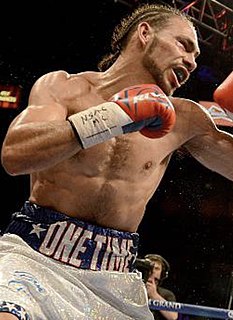
What I try to do is find a weakness in my opponent. A way that I can hit you. One good, clean shot. Try to time it. If I can get it and the shot is there, if I find that shot in the first round and they go down, they go down. I'm prepared for anything, not just to get first round knockouts. If they're there, I'm not gonna resist to take them.
The first time I came to the Comedy Festival some nutcase shot a bunch of people in Tasmania. I thought, 'Oh, that's just Tasmania.' The second time I came, some nut shot up Columbine High School. Now I'm here again, and another nut just shot up a high school in Minnesota. If you can't see the connection between me playing the Comedy Festival and mass murder, you're no good at conspiracy theories.
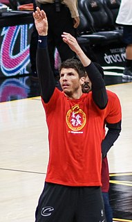
You look at the inner cities and you see bad education, no jobs, no safety. You walk to the grocery store with your child and you get shot. You walk outside to look and see what's happening, and you get shot. In Chicago 3,000 people have been shot since January 1st. I am not going to let that happen.
The time to hurry is in between shots. It's not over the shot. It's timing how people walk. You have to add that to the equation. If you've got somebody walking slow and they get up to the shot and take their 20 seconds, what's the aggregate time for them to hit that shot in between shots? That's what really matters. It's not the shot at hand.
