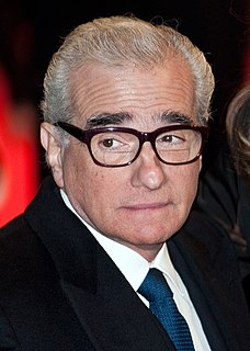
A Quote by William Friedkin

With all of my films that are on DVD and Blu-ray, I have spent weeks with them in a color timing room. Just changing or enhancing them. I have been desaturating the color. Sometimes I will make a scene bluer or redder. I do use the new medium. I believe in it.
I have control over every single frame on Blu-ray. If I want a scene bluer, I get that scene bluer. Originally, there was some fluctuation with the prints. If you made a thousand, or a few thousand prints, there is no control over any of that. But now I can make a master using the digital process.
I like both Blu-ray and DVD, but Blu-ray gives you more options.
There's one thing which I hate about color films... people who use up a lot of their despairing producer's money by working in the laboratory to bring out the dominant hues, or to make color films where there isn't any color.
With all the new technology, DVD's, Blu-Ray's, NetFlex, everyone has access to older movies. There is a new generation now of Freddy fans. Fathers that saw the movie originally, these guys are dads now, and they let their kids watch them.
My mantra is, 'Don't be afraid of color.' What did it do to you? Do a color testing in alternate kinds of light you desire in the room because the pigment will change. And I refuse to believe that pale pale or white colors in a small room will buy you more square footage. Go with color all the way.
The advent of DVD/Blu-ray reissues of classic Hollywood and foreign films has been a boon to film buffs, who can now study their favorites in all their glistening detail and restored palettes.
The difficulty with color is to go beyond the fact that it's color ? to have it be not just a colorful picture but really be a picture about something. It's difficult. So often color gets caught up in color, and it becomes merly decorative. Some photographers use it brilliantly to make visual statements combining color and content; otherwise it is empty.
Everybody's going to do the 3D slightly differently the same way that people are going to deal with color differently. Some movies downplay the color, some color is very vibrant. Color design is very different. We've got to think of 3D like color or like sound, as just part of the creative palette that we paint with and not some whole new thing that completely redefines the medium.
Munch writes poetry with color. He has taught himself to see the full potential of color in art His use of color is above all lyrical. He feels color and he reveals his feelings through colors; he does not see them in isolation. He does not just see yellow, red and blue and violet; he sees sorrow and screaming and melancholy and decay.
I love color. When I paint, I use a lot of color. I love art that has a vibrancy of color and compositions. I adore the Impressionists, and I'm influenced strongly by them as a self-taught artist.
For many years, I have been moved by the blue at the far edge of what can be seen, that color of horizons, of remote mountain ranges, of anything far away. The color of that distance is the color of an emotion, the color of solitude and of desire, the color of there seen from here, the color of where you are not. And the color of where you can never go.
I think the resolution involved in the high-def, Blu-ray image demands we pay attention to every detail to a level we've never seen before. The audiences have to believe everything they're seeing. As viewers, we're all so experienced and so much smarter than we realize. With Blu-ray, there will be less tricking of the eye.
So really what I am trying to do is create and understand form. But then too, color enters into it because a lot of things are color changes without a value change, which wouldn't show up if you were just using a non-color medium.
Apple! Boy, what a story. No taxes paid, everything made abroad - yet everyone worships them. This new iPhone, there’s nothing new in it. Just a golden color. What the hell, right? When people start playing with color, you know they’re played out.
When you write a song, most of the words you use are in black and white, and then, from time to time, you use one that’s in color. These words in color are a part of ourselves, because we give them a meaning. If you like, we give them a third dimension.
It's not enough just to elect people of color and women of color and progressives. We need to make sure that they have a work plan and that they are - continue to align with the communities that helped get them to where they're at.
This site uses cookies to ensure you get the best experience. More info...
Got it!